Interior Colour Trends: BED Studio’s Outlook on Colourways in Design
RAL Colour Feelings and Pantone colour trends are inspiring tools that spark conversation and ideas around colour in interiors.
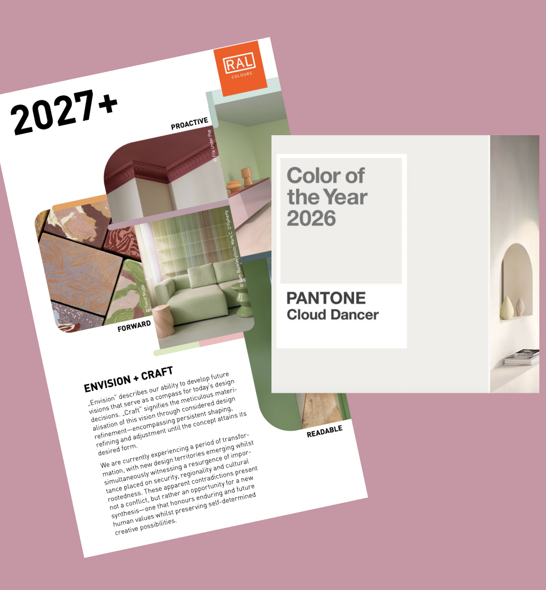
After reviewing the 2026 colour trends from industry leaders RAL and Pantone, we wanted to share how we approach colour in interiors. At BED Studio, we don’t treat trends as rules to follow, but as signals - insights into how people want to live, work, and feel within their spaces.
This guide is not a reinterpretation of trend reports. Instead, it reflects how we translate colour insights into considered, architectural design decisions across residential, commercial, and hospitality projects, with a focus on longevity rather than short-term impact.
Our Colour Philosophy
One shift is clear for 2026: colour is becoming quieter, more informed, and more intentional. Rather than asking what’s on trend, we ask how colour sits within architecture, how it behaves in different light, and whether it will still feel right years from now.
Industry is focusing on balance; between warm and cool, expressive and restrained, rather than extremes.
Colourways, Not Statement Colours
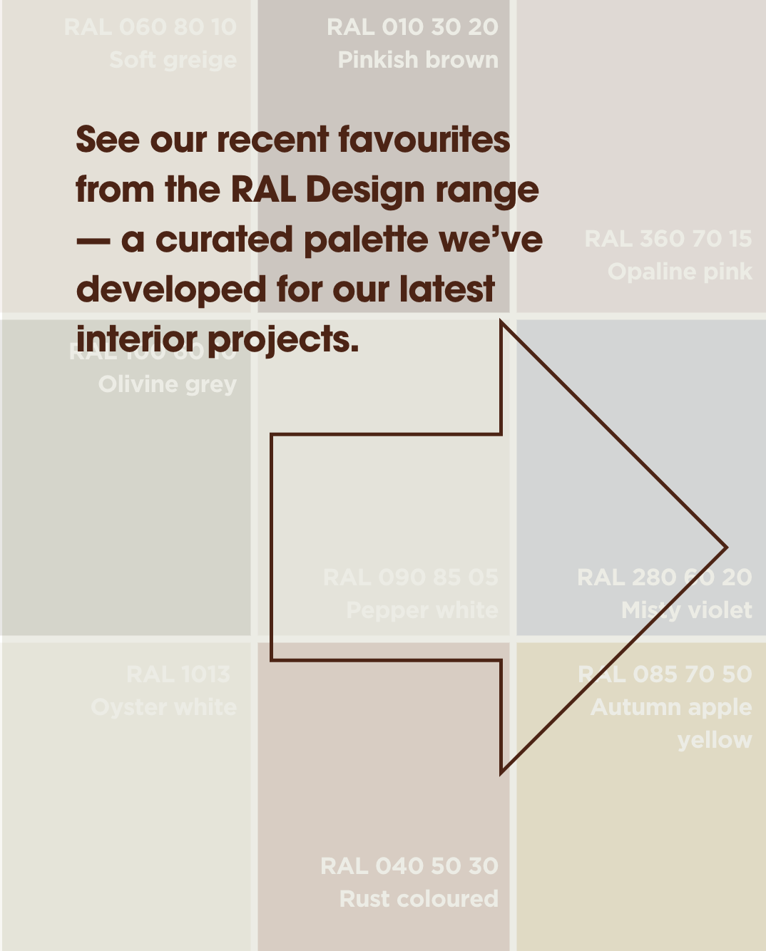
We design with colourways rather than single hero colours. Groups of related tones are layered across surfaces and materials, creating interiors that feel cohesive, calm, and enduring.
Soft neutrals form an architectural base, replacing stark whites and allowing materials to lead.
Earth tones add depth and permanence, particularly in joinery-led spaces.
Greens act as balancing neutrals, ideal for calm, focused environments.
Blues are used with structure and purpose, supporting concentration and contrast.
Accent colours are applied sparingly, as moments of punctuation, not dominance.

Designing for Longevity
Our focus is on continuity rather than reinvention. We choose colours that work across materials, adapt over time, and support how spaces are used, not dictate them.
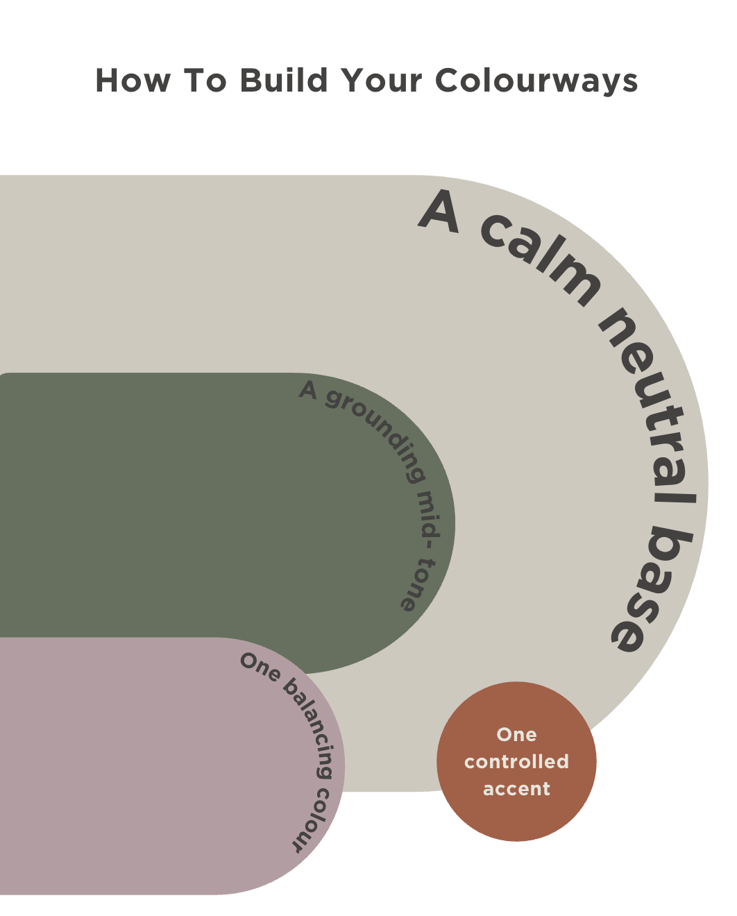
Rather than fixed palettes, we work with flexible frameworks: a neutral base, a grounding mid-tone, a balancing colour, and a controlled accent. This approach creates interiors that feel layered, adaptable, and resilient.
The value of colour guides lies not in prediction, but in encouraging thoughtful design. For us at BED Studio, colour is about clarity and confidence, creating spaces that feel relevant now and remain right for years to come.